Walkthrough: adding indicators to clearly highlight information about a node
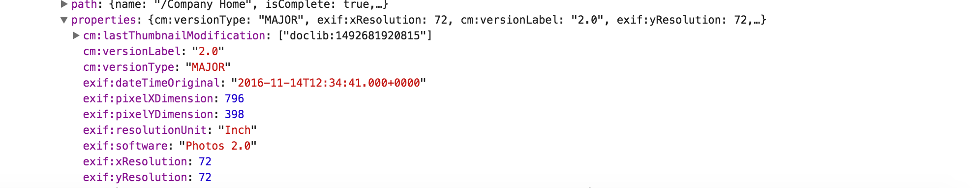
Every node object in the document list holds metadata information.
All metadata is stored inside properties property.
Here's an example of basic image-related metadata fetched from the server:
Custom column template
<alfresco-document-list ...>
    <data-columns>
        <data-column key="properties" [sortable]="false">
            <ng-template let-value="value">
                <adf-metadata-icons [metadata]="value">
                </adf-metadata-icons>
            </ng-template>
        </data-column>
        ...
    </data-columns>
</alfresco-document-list>
We are going to declare a column and bind its value to the entire properties object of the underlying node. The column will be using our custom <adf-metadata-icons> component to display icons based on metadata state.
MetadataIconsComponent component
Let's create a simple MetadataIconsComponent component with a selector set to adf-metadata-icons as shown below:
import { Component, Input } from '@angular/core';

@Component({
    selector: 'adf-metadata-icons',
    template: `
        <div *ngIf="metadata">
            <!-- render UI based on metadata -->
        </div>
    `
})
export class MetadataIconsComponent {

    @Input()
    metadata: any;

}
The component will expose a metadata property we can use from the outside and eventually bind data to similar to the following:
<adf-metadata-icons [metadata]="nodeMetadata"></adf-metadata-icons>As you have seen earlier the DataColumn binds to properties property of the node, and maps the runtime value as the value local variable within the template.
Next we propagate the value reference to the <adf-metadata-icons> component as metadata property.
<data-column key="properties" [sortable]="false">
    <ng-template let-value="value">
        <adf-metadata-icons [metadata]="value"></adf-metadata-icons>
    </ng-template>
</data-column>
So once rendered our component will automatically have access to entire set of node metadata. Let's build some visualization of the cm:versionLabel property.
For demonstration purposes we are going to display several icons if underlying node has version 2.0, and just a plain text version value for all other versions.
<div *ngIf="metadata">
    <ng-container *ngIf="metadata['cm:versionLabel'] === '2.0'">
        <mat-icon>portrait</mat-icon>
        <mat-icon>photo_filter</mat-icon>
        <mat-icon>rotate_90_degrees_ccw</mat-icon>
    </ng-container>
    <div *ngIf="metadata['cm:versionLabel'] !== '2.0'">
        {{metadata['cm:versionLabel']}}
    </div>
</div>
Note: For a list of the icons that can be used with <mat-icon> component please refer to this resource: material.io/icons
Testing component
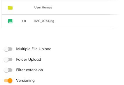
You will need to enable versioning feature for the Document List to be able to upload multiple versions of the file instead of renaming duplicates.
Drag and drop any image file to upload it and ensure it has 1.0 displayed in the column:
Now drop the same file again to upload a new version of the file. You should now see icons instead of version label.
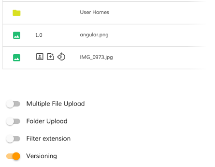
You can see on the screenshot above that only files with version 2.0 got extra icons.
Conclusion
The full source code of the component can be found below:
import { Component, Input } from '@angular/core';

@Component({
    selector: 'adf-metadata-icons',
    template: `
        <div *ngIf="metadata">
            <ng-container *ngIf="metadata['cm:versionLabel'] === '2.0'">
                <mat-icon>portrait</mat-icon>
                <mat-icon>photo_filter</mat-icon>
                <mat-icon>rotate_90_degrees_ccw</mat-icon>
            </ng-container>
            <div *ngIf="metadata['cm:versionLabel'] !== '2.0'">
                {{metadata['cm:versionLabel']}}
            </div>
        </div>
    `
})
export class MetadataIconsComponent {

    @Input()
    metadata: any;

}
You can use this idea to build more complex indication experience based on the actual metadata state.